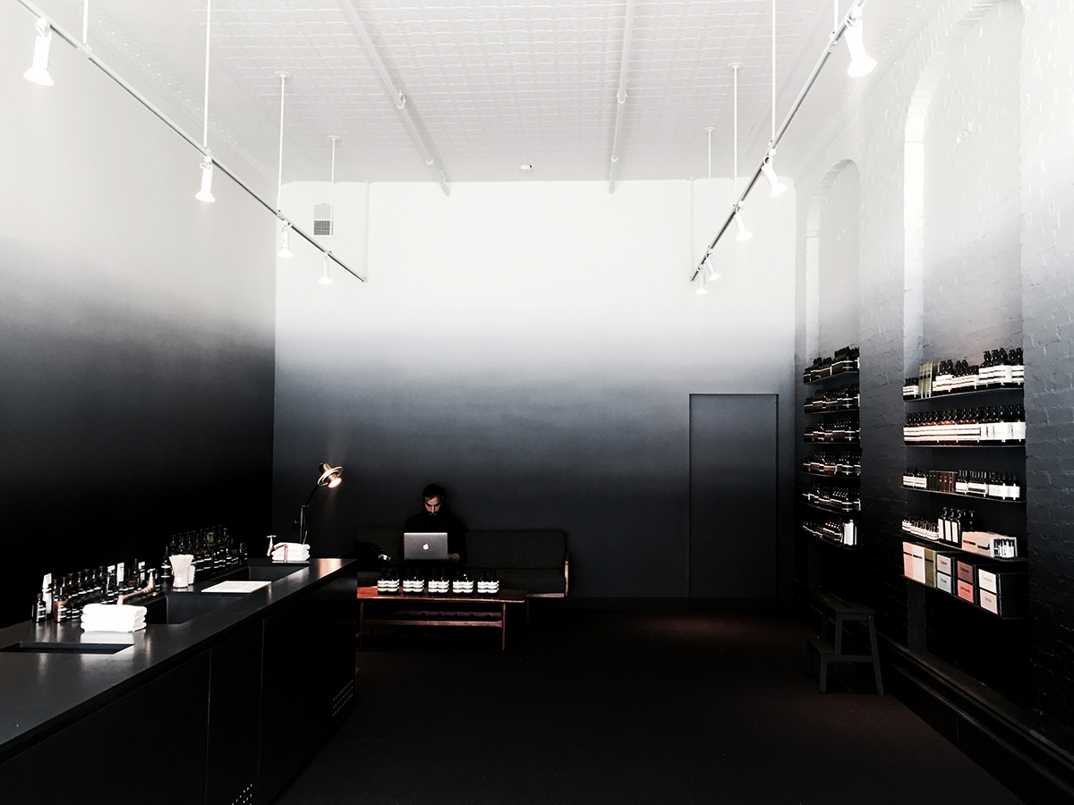
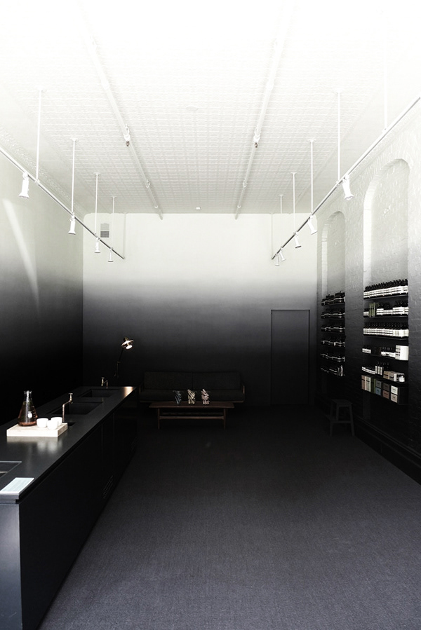
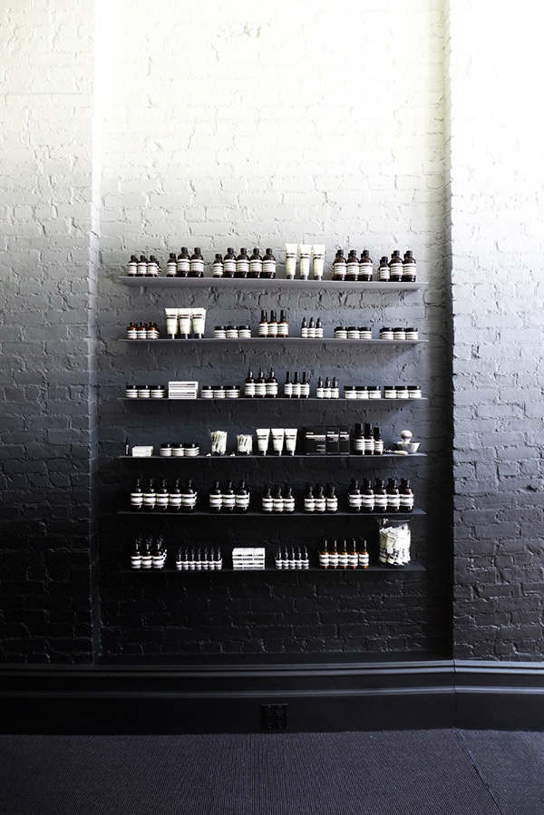
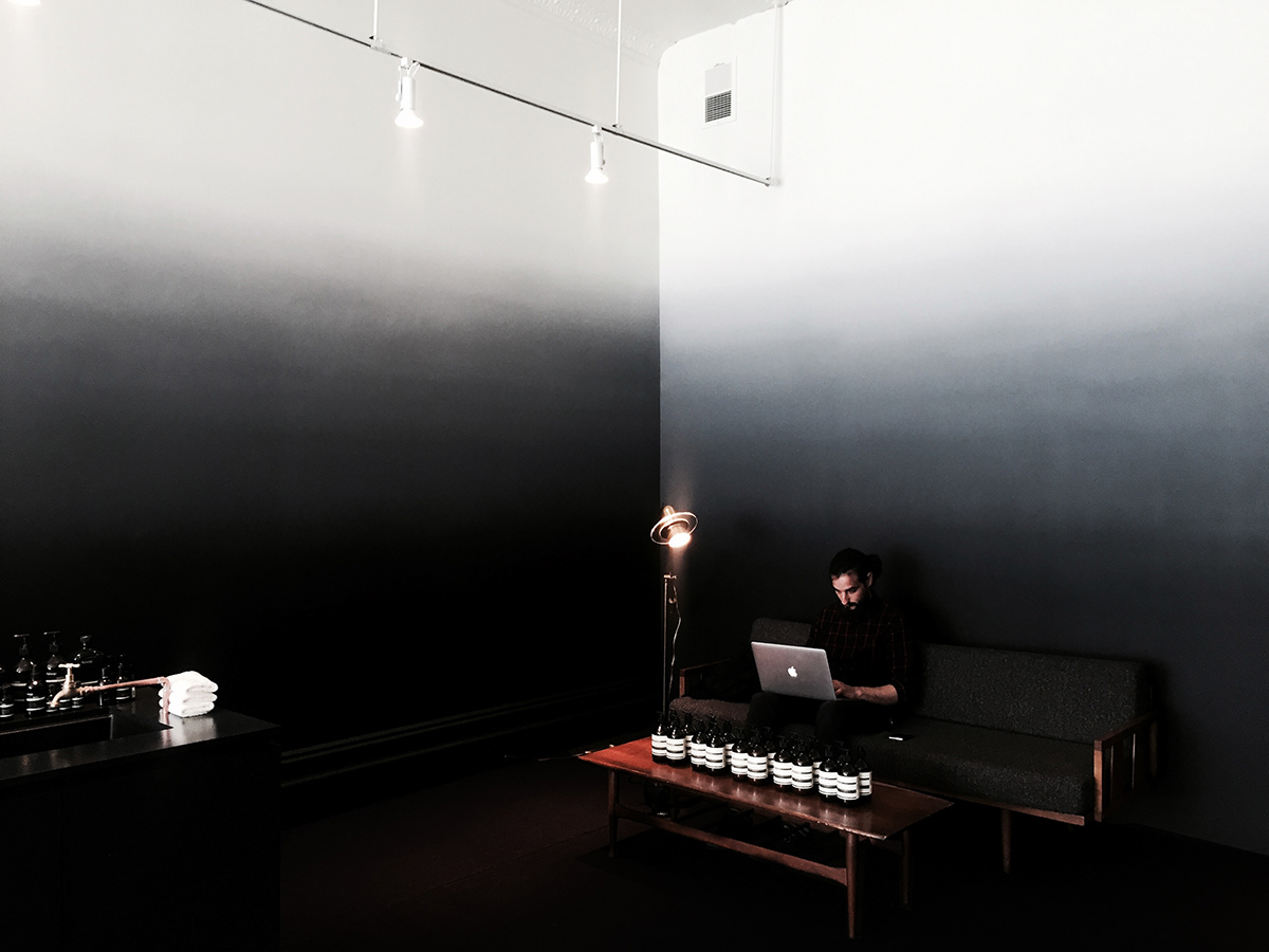
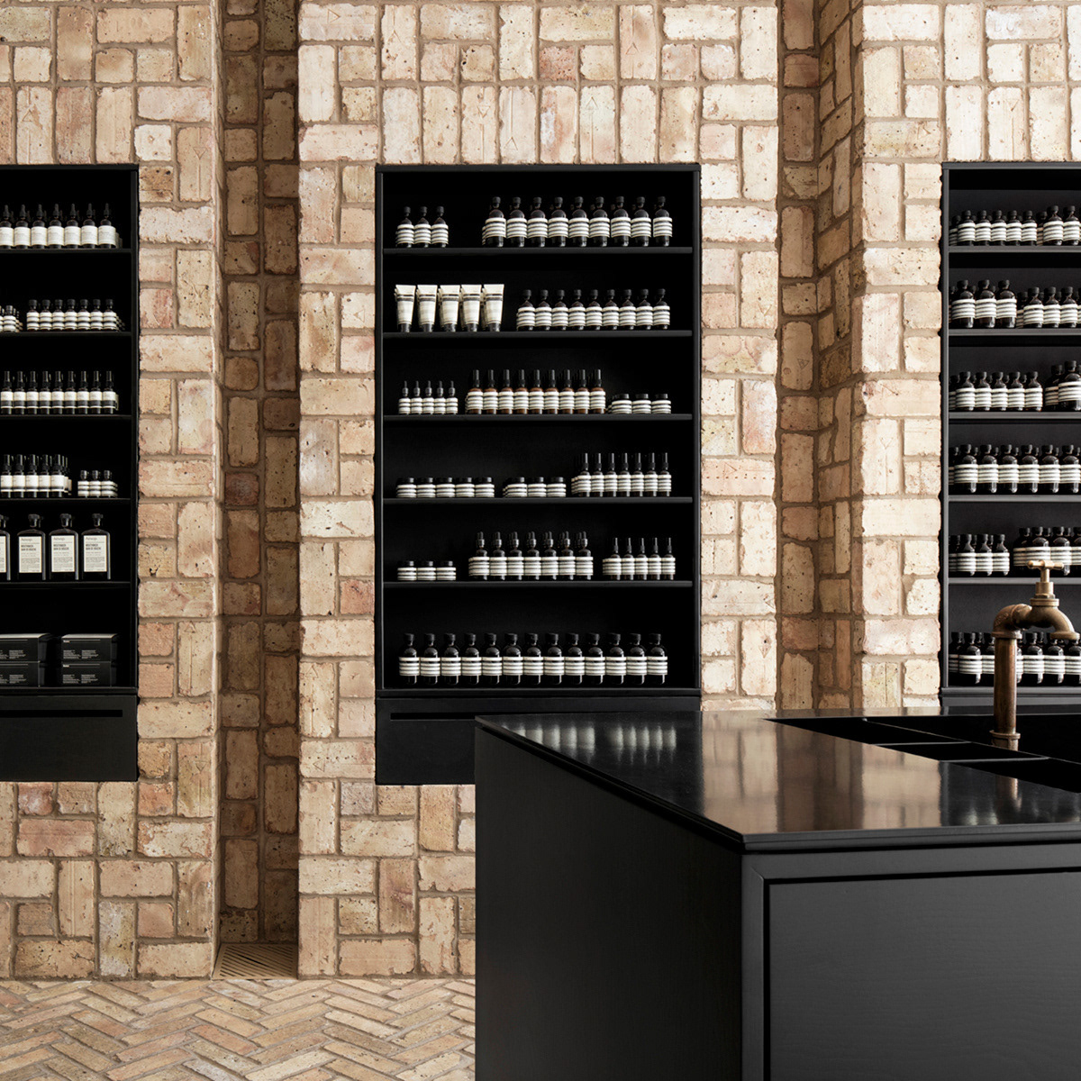
The simple design of this pop-up space for Aesop Skincare was based in the archetype of the tribeca artists' studio, in which artwork and material is heaped around the perimeter of a space, and occupies a consistent stratum, but tends not to climb the walls. This aggregation has been mimicked with color. The look and feel of Aesop Tribeca is all superficial – in a good way. The sale and consultation area is cut in half. Above you, a crisp white ceiling. No features here, just white. At eye level, a gentle transition gradates towards a black floor. Here, black is all features. Black is the finish with greatest flexibility. Black conceals and reveals. At the scale of furniture, display, and consultation, black transitions from smooth to rough, hard to pliable, satin to grit. The front of house and its respective elements float in a sea of black. The only true identifiable features are the products’ iconic labels.
Design Team:
Carrie Norman
Thomas Kelley
Spencer McNeil